Large format print or wide format print, whichever term you prefer, covers a wide range of products of all shapes and sizes - indeed at Banner Box we have over 100 different products of which there are a number of size and styles variants which can be loosely grouped into;
When it comes to creating the artwork for your next display, there's a number of aspects you'll need to take into consideration to ensure the end product has maximum impact. Here's a brief overview of our 5 top tips we would always advise you to keep in mind.
1. Speak to your printer
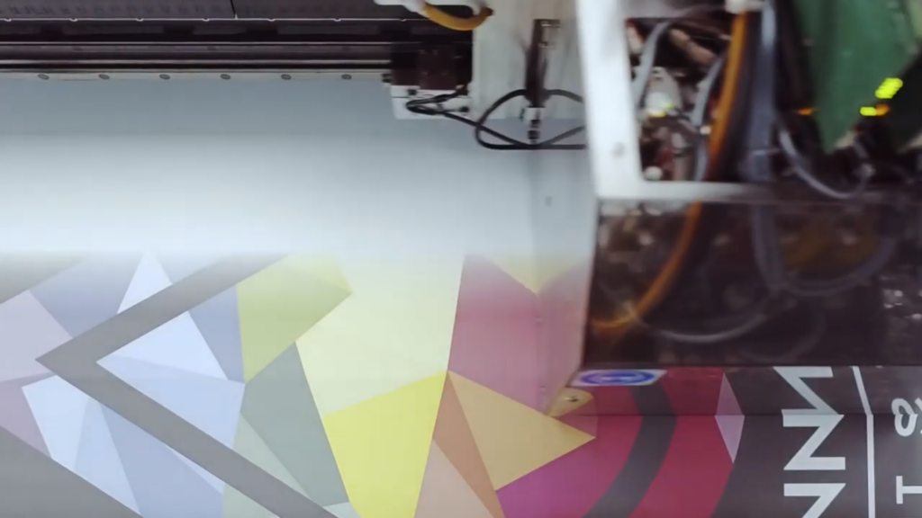
Our top tip when designing large format graphics, unless you're working with a firm and product you are very familiar with, is to start by talking with your printers and ensuring that you clarify everything that’s necessary.
A few questions you should always think about asking as a starter include;
- What printing equipment they use
- Any specific requirements they have
- How they’d like you to prepare and send over the files.
If the printer is planning to use a specific material, for example, you may need to adjust the colour palette you’re using.
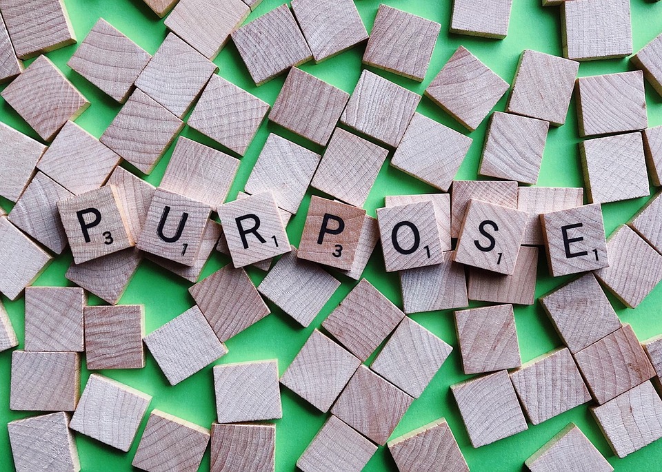
2. Start with a purpose
Once you've been briefed by the printer, but before starting to design your display, firstly take the time to think about;
- What the objective of this sign is, is your display looking to advertise, identify or inform?
- Who are you looking to appeal to? Remember to look back at your "ideal customer profiling" on this.
If you start by clearly defining what you are looking to achieve with your sign and who your looking to reach, then you’re much more likely to create an effective finished product.
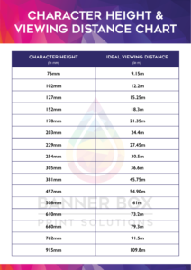
3. Is it readable?
When designing your display, it’s important to understand where it will be located as this will determine what specific product and material is best suited to meet your needs. You'll also need to think about where it will be viewed from to ensure any text is readable from a distance. It's easy to get carried away designing something that look spectacular on a computer screen but if it's not readable, then it won't achieve much...
Here’s a letter visibility chart which you might find useful in the future.

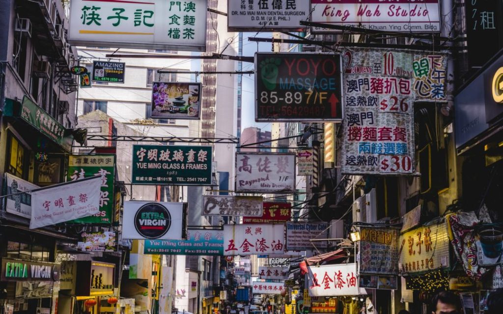
4. Use contrasting colours
Contrasting colours don’t just help catch the attention of a passer-by, they’re also very important when it comes to a display’s readability, especially in areas that might be subject to direct sunlight. All things considered, it’s generally good practice to go with dark text on a light background, or vice versa.
Check out our insider's guide to colour for more information.
5. Less is more
When it comes to large format print in general, less is definitely more.
When customers are reading your messages from a distance, it pays to keep things simple... aim for a short message and a clear call to action on a clean background – remember you probably have a maximum of 5 seconds to catch your prospect's attention and get your message across.
Need some help?
At Banner Box we have an in-house team of designers who have years of experience within the large format print industry. We're more than happy to offer advice on your next project, or alternatively we can work with you to create your artwork and ensure that you get the results you are looking to achieve.
