You’d be forgiven for thinking that it’s easy to design a café barrier. Many people think that it is as simple as getting a rectangle in the right dimensions and going ahead with production. However, there are several areas where people regularly make errors when designing their café barriers and banners.
Making a mistake in print can be costly, and potentially damaging to your business’ reputation.
We spoke to Studio Manager, Rob Shelton, to highlight the most common mistakes people make when designing café barriers. Check out the top 5 faults and make sure you and your customers act before you make them.
Want to learn more about artwork requirements? Read our guidelines here or speak to our team today on 01246 472 949.
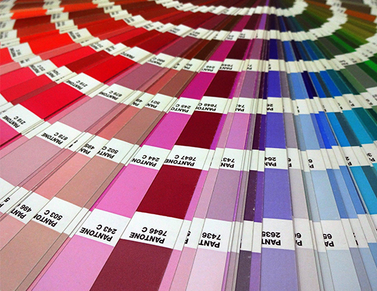
Mistakes with colour
When submitting artwork to commercial printers, it is important to check that you are using the correct colour channels and meeting the artwork requirements set by the printer. If you send graphics to the printer in the wrong format you risk getting back strange, muddy or mismatched colours. Not ideal.
Most printers will ask you to use CMYK, which is a smaller colour space than RGB. RGB can reproduce many more colours than printing is capable of and is traditionally reserved for digital display. CMYK uses four process inks to create a spectrum of colours to print, and these can often appear differently from those formatted in RGB.
Ensure you convert your files to CMYK before sending to the printer to guarantee your results match your expectations and to avoid any problems with colour shift that may occur.
Looking for exact colour matching? If you want assurance your colours will come as you expect, you should also provide your printer with specific Pantone colours. Learn more about matching to Pantone here.
Problems with images
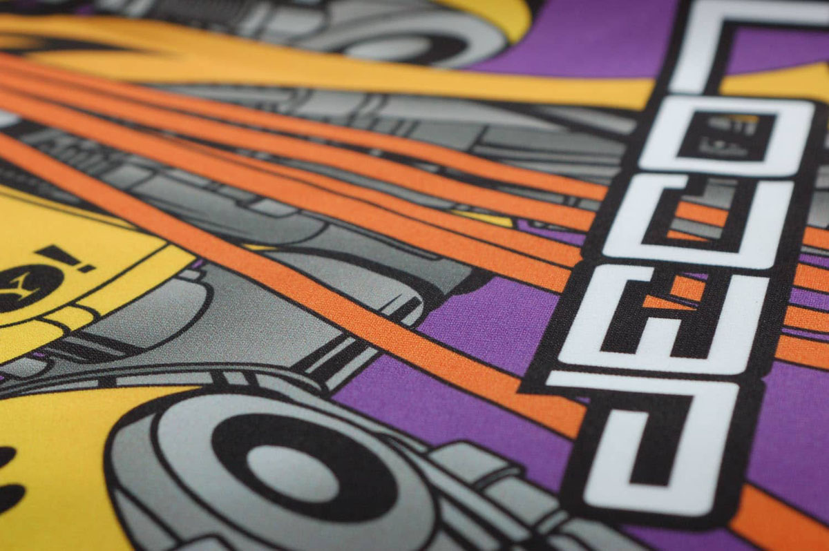
Just because an image looks good on a computer screen, this is no promise that it will look as good when printed. It is crucial to the quality of your print to check the resolution and standard of the images you want to use before committing them to print.
Do you want to include photos in your design? Make sure they are high resolution images – at least 150 dpi (dots-per-inch) and can easily be scaled to the measurements of the barrier without pixelating. When trying to promote your brand or product, there’s nothing more unprofessional than blurry faces or rugged edges.
If possible, you should stick to using vectors for your café barrier design. Vectors use graphics based on mathematical formulas instead of square pixels which means they create clean and infinitely scalable images and offer crisper lines and displays. Using vectors means that your images, logos, or icons can be scaled to any size with ease and won’t run the risk of being obscured.
Studios occasionally receive artwork saved as word documents, powerpoints, or other incompatible formats like GIFs. These rarely meet the standards of quality to be used in print. For the best results, you should always provide your artwork as pdf, .ai, .eps, jpeg or PNG. See the full details of acceptable formats here.
Mistakes with text
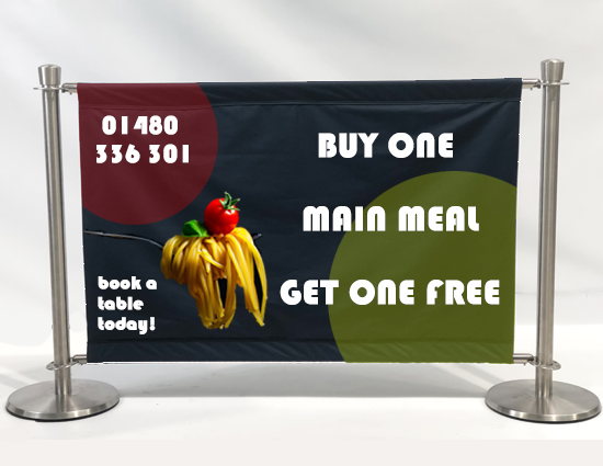
Whilst most café barriers opt for a simple design, there are many businesses who use café barriers to display information, offers or further details about their brand. If you are choosing to add more to your design, it is important to keep in mind the elements that are helpful and those that are hindering the effect.
Too much text on the barrier can mean your barrier is cluttered, hard to read, and less impactful as a design. Café barriers are there to be an eye-catching tool and can help with instant brand awareness. If a passer-by must read line after line of text, it’s unlikely it will have the same effect as a clear logo and an effective tagline.
If you’ve chosen a succinct sentence to display, the next thing to get right is your font choice. We often see designs with fonts that are too elaborate and intricate, meaning they’re hard to read or fonts that on screen would look sleek and modern, but in print are too thin and get lost in the background.
And ofcourse, theirs the age-old issue off spelling and gramma mistakes. Make sure you catch all errors before the project goes to print. Not only embarrassing but can end up being very costly if it’s been printed on multiple café barriers.
Errors in layout
Just like with text, it’s worth keeping in mind the number of elements you’re including in your café barrier design. It is up to each business to find their own comfort level between a plain colour barrier and an overly full and cluttered design.
Whether you’re going for simple or attention-grabbing, you don’t want your message to get lost. Before sending off to print, imagine you’re walking down the high street and whether you’d notice the café barrier and whether you’d get what it wanted you to know. No? It may be time to edit the layout.
Does your organisation have brand guidelines? Take a second to refresh them in your head and make sure your café barrier has met all of them. The last thing you want is to reprint all your barriers because a logo is slightly off centre or overlapping with other elements.
Customers often forget that café barriers have two sides. You can customise both sides differently but if you’re printing your design onto both the front and back of your barrier, consider how the design will look when flipped or depending on your artwork and material choice, whether it will show through to the other side. Symmetry can be your friend but here we appreciate that’s not always possible.
Mistakes in finishing
Café barriers can look vastly different depending on which material they are printed on. It’s very important you understand which material you’re using for your café barrier, and how this will affect the use of colour or other finishing touches. Not sure which fabric is best for your needs? Explore the three options we offer here.
As we said at the beginning, it’s not just the case of getting the dimensions of a rectangle. Remember to consider the measurements for the pocket area and adapt your design to account for the material that will go around crossbars and have seams sewn in.
Using margins of at least 50mm will guarantee that your design stays within the guidelines and doesn’t risk getting cut off when the café barrier is manufactured.
Banner Box Print Solutions has a team of highly skilled designers who are on hand to amend artwork and advise customers on how to get the best café barrier print possible. We provide detailed proofs for every single job and do not proceed until the client is satisfied with the way the print will look and are confident that these mistakes won’t happen.
Speak to the Banner Box team to make sure your artwork and designs have not fallen victim to any of these common design mistakes.
Ready to order your café barriers? Read our blog on how to avoid cryptic order requests, and make sure all your details are crystal clear. Call 01246 472 949 to speak to our team today and place your order.
