An Insider’s Guide to Colour
The topic of colour is very broad, and covers multiple areas of study including physics, biology, mathematics, and when looking at certain types of colour models (like RGB), engineering.
We are so used to colour in our every-day life. We were born recognising colour, our society and culture is intimately entwined in our collective use of colour, and colour continues to affect our state of mind and imagination – and probably will forever do so.
However to understand the nature of colour (and thus, the topic of this article – understanding CMYK, Pantone, and RGB), we need to do a little background research in colour.
What is a colour?
Colour as we know it (red, blue, etc.) is a result of different wavelengths of visible light interacting with light receptors in our eye. In our familiar sense of colour, it doesn’t exist in nature – light is light – it is our unique biology that makes certain wavelengths of light appear red, or blue, etc. Objects in our every day world have colour because they ever create light, reflect light, or absorb light.
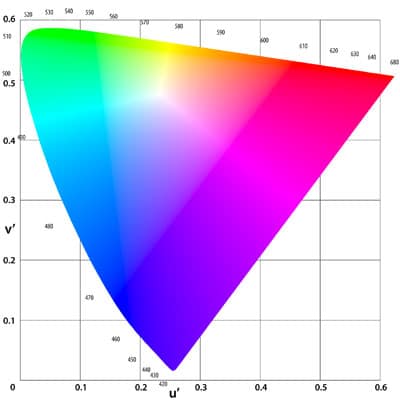
The image on the left is a representation of the human colour space, the range of colours which a human eye can see.
That is where the simple understanding of colour ends, for now our explanation takes a somewhat abstract turn to understand colour models and colour spaces.
A colour model is a mathematical system of describing colours, by using a set of tuples (set of numbers, or coordinates), typically a set of 3 or 4 numbers. A model is then assigned a mapping function (which determines how the numbers are to be interpreted), and that gives you a colour space. RGB and CMYK are examples of colour models, namely that they have a set of tuples which determine the colour displayed. In RGB, the set (255,0,0) will create a post-box red colour, whereas (19,32,204) will create a dark blue colour.
RGB

The RGB colour model is one of the best-known colour models around.
Known as an additive colour model, the colours available in the RGB colour space are made up of a combination of the three “primary” colours, namely red, green, and blue. Each value of those three colours can be a maximum of 255, so for example (0,0,0) is pure black – no colour at all – and (255,255,255) is pure white – all three colours at maximum.
The image on the right is a good example of this. The red, green, and blue are the primary colours on the outside, and in pairs combined they create (not coincidentally) a cyan, magento, and yellow colour. If all three are mixed, they create white light.
RGB colours are used on mediums such as LCD screens, and use electromagnetic (light) emissions to create their colour. So when you see red only (255,0,0), you are only seeing light with the wavelength that corresponds to red. When you see blue (0,255,0) light, you are only seeing the wavelength associated with blue, etc. Therefore, to get a teal colour, you need to create a mixture of the 3 primary colours. In this case, a teal colour can be achieved with (67,137,113).
Assuming you are looking at this page on a digital screen, you are seeing representations of all colours in the RGB space. While this might be tricky to grasp, there are more colours that we can see that are not found in the RGB space. This is where CMYK comes in.
CMYK

CMYK is the name of a colour model used by including cyan (C), magenta (M), and yellow (Y) in combination, sometimes with black (called “key”, hence the K) tuples in the description of the colour. When applied with the correct reference, this creates a colour space unique to CMYK.
CMYK is a subtractive colour model – opposite to the additive model of RGB – which means that instead of adding colours to get the desired mix, the CMY inks/dyes are added to a white subtrate (posh name for the material printed on) in quantities to reflect certain wavelengths (colours), leaving only the desired wavelength (colour) to reflect to the user’s eye.
What does that mean? It means that to achieve a colour, you need to add appropriate amounts of either C, M, Y, or K inks, so that when light reflects off the substrate, only the desired colour remains. The cyan ink, for example, absorbs red light but transmits green and blue. Magenta absorbs green light but transmits red and blue, and yellow ink absorbs blue but transmits red and green.
However, often this colour space lacks a kind of depth when it comes to darker colours. Therefore printers usually add an amount of black ink (designated the key), to add some more colour depth.
If you’ve understood the difference between RGB and CMYK, you might have already twigged that the colours you see to the left are not true CMYK colours – they are RGB representations of CMYK!
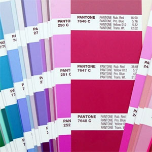
PANTONE

The Pantone colour model is a different kettle of fish compared to RGB and CMYK. Based less around a set of tuples and more a standardised set of decided colours, Pantone has become popular with many different aspects of printing.
Devised by the company Pantone Inc., the colour system is partly-compatible with CMYK, but largely incompatible. That means that the CMYK colours can be used to create some Pantone colours (i.e. some Pantone colours are within the CMYK gamut), however most Pantone colours cannot be created via CMYK.
Because of Pantone’s wide acceptance by companies, governments, militaries, etc., and the fact that it is only partly compatible with CMYK, Pantone has remained a popular choice for print providers such as ourselves.
Pantone Inc recently unveiled their Colour of the Year for 2014, named “Radiant Orchid” (code 18-3224). Pantone’s description of the colour is: “Radiant Orchid blooms with confidence and magical warmth that intrigues the eye and sparks the imagination. It is an expressive, creative and embracing purple—one that draws you in with its beguiling charm. A captivating harmony of fuchsia, purple and pink undertones, Radiant Orchid emanates great joy, love and health.”
Colour models we use
Here at Banner Box we can work with all three colour models discussed above – RGB, CMYK, or Pantone – however mainly we use Pantone for it’s standardisation, meaning our clients can be almost guaranteed that the Pantone colours they see on their artwork are going to be the ones that are printed.
One thing to note is that the Pantone guides are for solid form – e.g. paper – and we are sometimes asked to print on translucent flag, so sometimes the very dark colours aren’t possible on this medium.
Whenever we receive artwork from a client, we check that their requested Pantone colours are in the formula guide (we use Pentone Coated (C) colours) and are usable for the selected fabric (as each fabric has its own printed chart!), and if not we match it to the nearest colour we can reproduce, often with no noticeable change.
Our printers do accept RGB colours, although they can’t reproduce them perfectly (because RGB is light based, not ink based), but they can work perfectly well with CMYK colours. We also have some direct-to-textile printers that have additional coloured inks such as Red, Orange, Violet and Green which help us to extent the CMYK colour gamut, allowing us to get cleaner colours such as bright Orange.
